Correlation coefficient
The correlation coefficient (\(r\)) describes the strength and direction of the linear relationship between two variables. It is always a scalar number that can take any value between −1 and 1:
$$-1 \le r \le 1$$
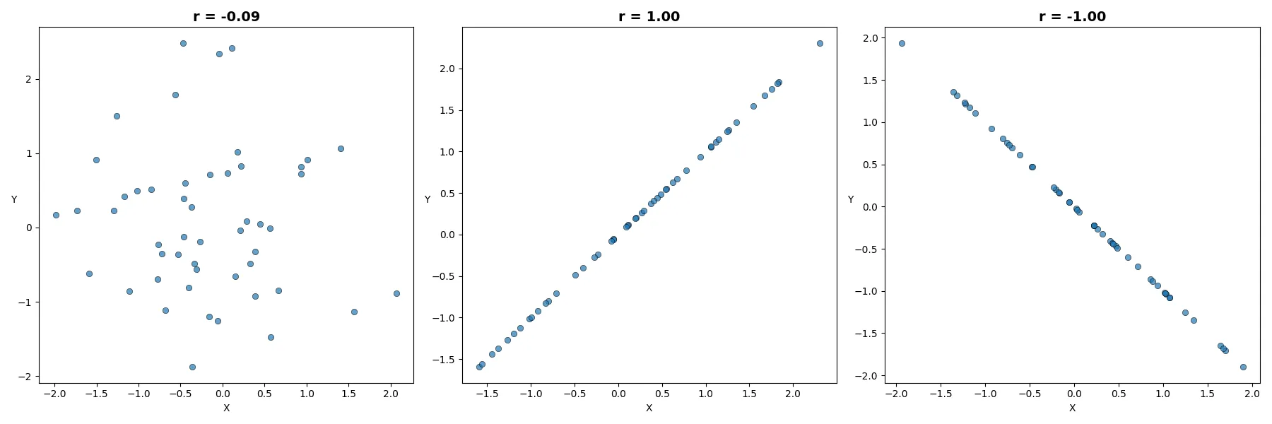
r = 1 — perfect positive correlation: all points lie exactly on a straight line that slopes upward.
0 < r < 1 — a positive relationship: as one variable increases, so does the other. Values closer to 1 indicate a stronger relationship, with points clustered closer to a straight line; values closer to 0 indicate a weaker relationship.
r = 0 — no linear relationship; points are randomly distributed across the chart.
−1 < r < 0 — a negative relationship: as one variable increases, the other decreases. Values closer to −1 indicate a stronger relationship, with points clustered closer to a downward-sloping straight line; values closer to 0 indicate a weaker relationship.
r = −1 — perfect negative correlation: all points lie exactly on a straight line that slopes downward — as one variable increases, the other decreases.
You can compare scatter plots of datasets whose correlation coefficients are as described above
for values close to 0, equal to 1, and −1:
Note: All Python code used to create the visuals is available in the article at the following link: Statistics: Correlation Coefficient
In each row below, every subsequent scatter plot has a greater absolute value of the correlation coefficient. You can observe how larger correlation values correspond to points becoming less scattered and more tightly clustered around a straight line.
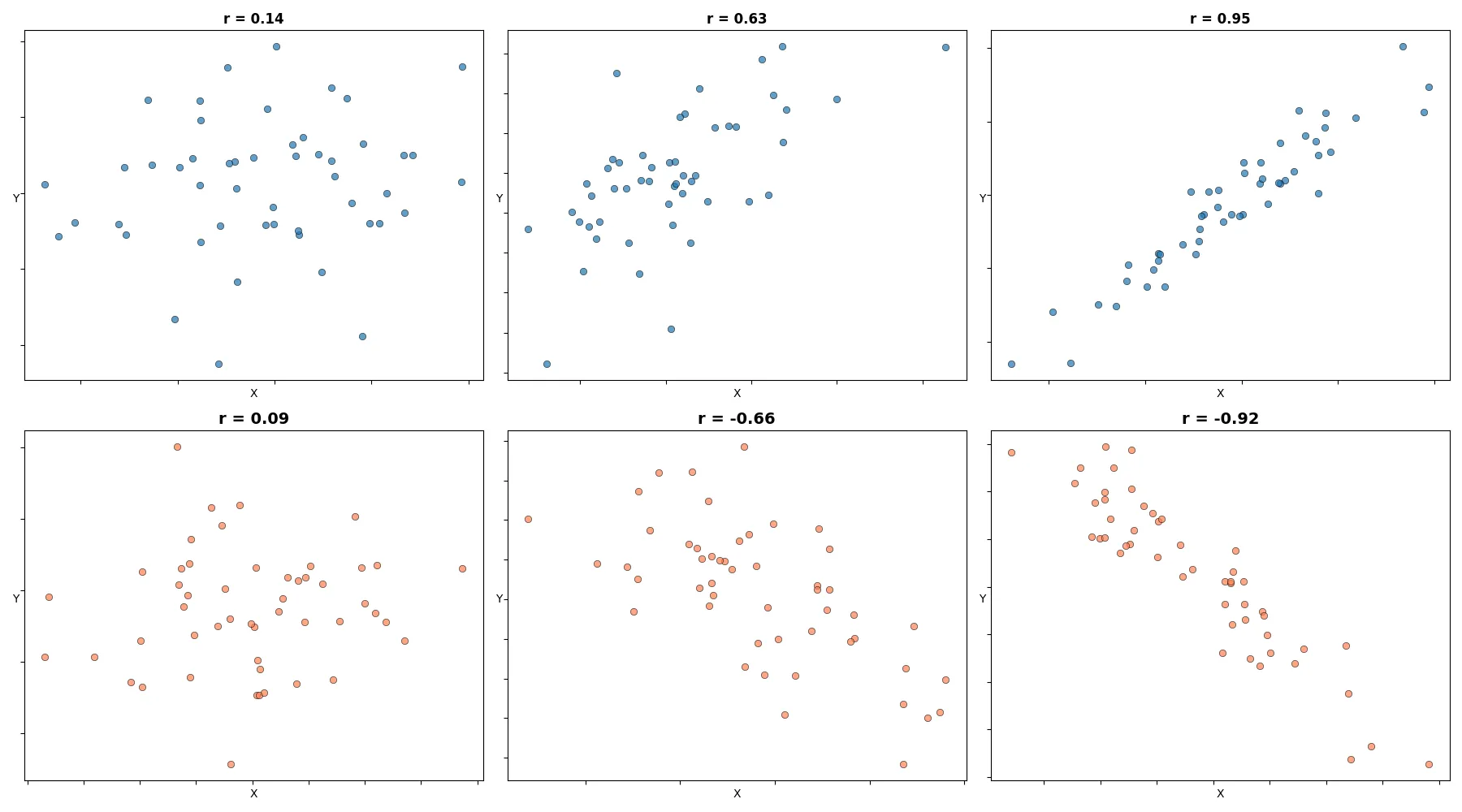
Figure 1. Each scatter plot consists of 50 points; above each plot, the \(r\) value calculated for that dataset is shown. Notice that with \(r = 0.14\), the correlation is barely visible, while for \(r = 0.95\), the correlation is perfect: every point lies on a straight line.
Below you can find a few formulas for calculating the correlation coefficient. After rearranging, one formula can be converted into another. You can choose whichever is most intuitive for you. Depending on the task, one formula may be more fitting than another.
Formula referring to raw data variables \(x\) and \(y\), and their means:
$$r = \frac{\displaystyle\sum_{i=1}^{n}(x_i - \bar{x})(y_i - \bar{y})}{\sqrt{\displaystyle\sum_{i=1}^{n}(x_i - \bar{x})^2 \;\cdot\; \displaystyle\sum_{i=1}^{n}(y_i - \bar{y})^2}}$$
• \(x_i, y_i\) are the individual sample points indexed with \(i\)
• \(\bar{x}, \bar{y}\) are the sample means: \(\displaystyle\bar{x} = \frac{1}{n}\sum_{i=1}^{n}x_i\)
Covariance form:
$$r = \frac{\text{cov}(X,\,Y)}{\sigma_X \;\sigma_Y}$$
• \(\text{cov}(X, Y)\) is the covariance of \(X\) and \(Y\)
• \(\sigma_X\) is the standard deviation of \(X\)
• \(\sigma_Y\) is the standard deviation of \(Y\)
Computational (shortcut) formula:
Often used for manual or programmatic calculation:
$$r = \frac{n\sum x_i y_i - \left(\sum x_i\right)\left(\sum y_i\right)}{\sqrt{\left[n\sum x_i^2 - \left(\sum x_i\right)^2\right]\left[n\sum y_i^2 - \left(\sum y_i\right)^2\right]}}$$
Standard units formula:
\(r\) = average of (\(X\) in standard units) × (\(Y\) in standard units):
$$r = \frac{1}{n-1}\sum_{i=1}^{n} z_{x,i}\;z_{y,i}$$
• \(\displaystyle z_{x,i} = \frac{x_i - \bar{x}}{s_x}\)
• \(\displaystyle z_{y,i} = \frac{y_i - \bar{y}}{s_y}\)
What is the random variable most positively correlated with X?
The random variable that correlates most positively with X should increase exactly with X and decrease exactly with X. The only random variable that accomplishes this feat is X itself. This implies that the correlation coefficient between X and any random variable Y is less than that between X and itself. That is,
\[\rho_{xy} \le \rho_{xx} = \frac{\operatorname{Cov}(X, X)}{\operatorname{Var}(X)} = \frac{\operatorname{Var}(X)}{\sigma_x \sigma_x} = 1 \]
What is the random variable least positively correlated with X?
In other words, we are looking for a random variable with which the correlation between X and this random variable is the most negative it can be. This random variable should increase exactly as X decreases, and it should also decrease exactly as X increases. The candidate that comes to mind is −X. This would imply that the correlation coefficient between X and any random variable Y is greater than that between X and −X.
This implies that:
\[ \rho_{xy} \ge \rho_{x,-x} = \frac{\operatorname{Cov}(X, -X)}{\sigma_X \, \sigma_{-X}} = -1 \]
Hence, we conclude that \( -1 \le \rho_{xy} \le 1 \).
The correlation coefficient remains constant in the following cases:
1. Scaling units: Changing the units of a dataset, such as converting from meters to centimeters.
2. Swapping axes: Calculating (r) after switching the (X) and (Y) variables (even though the visual appearance of the plot changes).
3. Linear transformations: Adding a constant to or multiplying a variable by a positive constant.
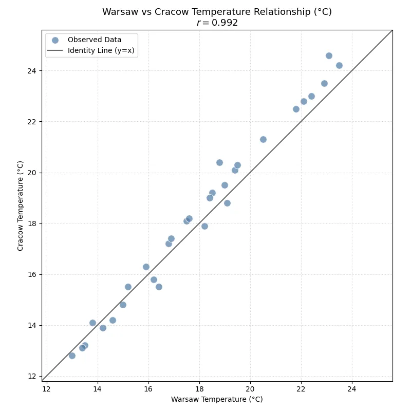
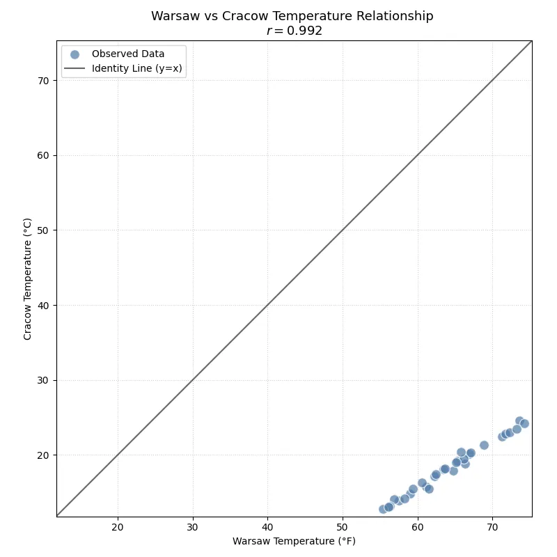
Below you can see a scatter plot presenting the correlation of 30 daily temperature averages in Warsaw and Cracow in June, measured in degrees Celsius. The correlation coefficient for this dataset is shown in the title: \(r = 0.992\). The high correlation can be explained by the relatively short distance between these cities, which lie around 250 km from each other, so all points tend to be close to the 45-degree line. (This line serves only as a reference — if on any given day the temperatures in both cities were the same, the point would lie exactly on it.)
On the next scatter plot, the values from this dataset have been recalculated to show temperatures for both Warsaw and Cracow in degrees Fahrenheit.
The formula for converting from Celsius to Fahrenheit is as follows:
$$F = \frac{9}{5}\,C + 32$$
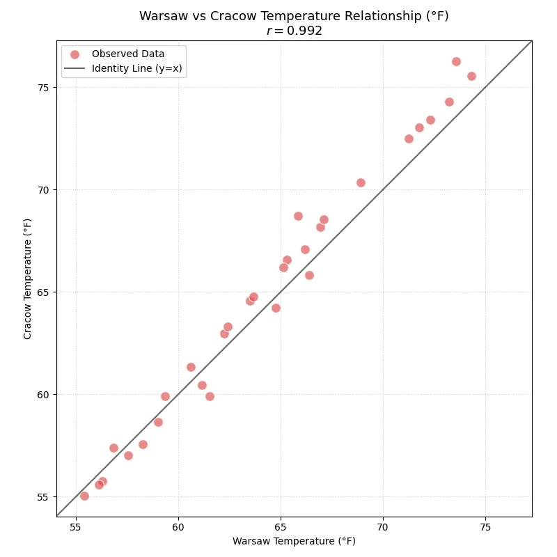
As you can see, even though both addition and multiplication were applied when recalculating the temperatures — resulting in a changed scale where Fahrenheit values are greater than Celsius — the shape of the point cloud and the correlation coefficient remained the same.
Next, you can observe something perhaps less intuitive. After converting only the Warsaw temperatures from Celsius to Fahrenheit — which significantly shifts the scatter points away from the 45-degree line toward the bottom-right part of the plot — the correlation coefficient still did not change.
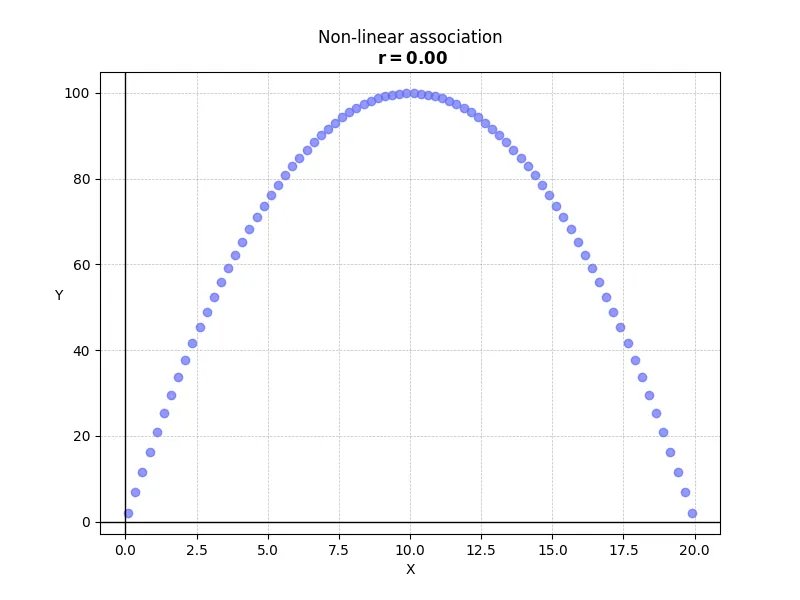
1. Non-linear associations
The correlation coefficient measures only the strength of the linear relationship between variables. While a clear association is evident in the plot below, the non-linear nature of the data results in a correlation coefficient near zero.
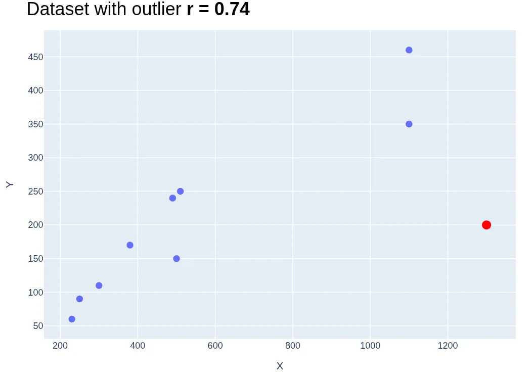
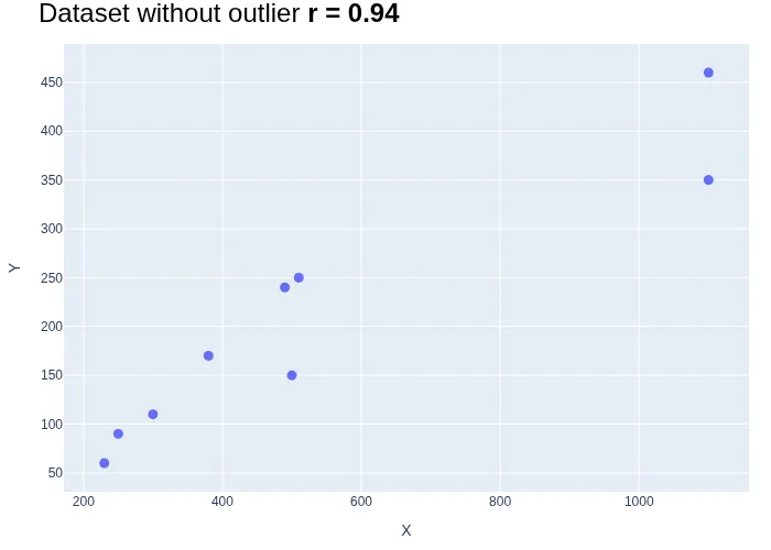
2. Outliers
The correlation coefficient is highly sensitive to outliers. Even a single extreme value can significantly distort the coefficient, often masking an otherwise clear relationship. The plots below illustrate how a single outlier—the red point in the first plot—shifts the correlation coefficient by nearly 30% once it is removed from the dataset.
3. Ecological fallacy
This occurs when conclusions about individuals are drawn from group-level averages or aggregate data. The correlation coefficient is often significantly higher when calculated using national averages than when based on the raw, individual-level data from which those averages were derived.
In his book, Daniel Kahneman described how he used a correlation coefficient to assess the impact of skill on the investment outcomes of professional wealth advisors:
"I was granted a spreadsheet summarizing the investment outcomes of some twenty-five anonymous wealth advisers, for each of eight consecutive years. Each adviser’s score for each year was his main determinant of his year-end bonus. I computed correlation coefficients between the rankings in each pair of years: year 1 with year 2, year 1 with year 3 , and so on up through year 9 with year 9. That yielded 28 correlation coefficients, one for each pair of years. I knew the theory and was prepared to find weak evidence of persistence of skill. Still, I was surprised to find that the average of the 28 correlations was 0.01. In other word, zero. The consistent correlations that would indicate differences in skill were not to be found. (…) Our message to the executives was that, at least when it came to building portfolios, the firm was rewarding luck as if it were skill."